PHASE 1 → Target Oct. 22, 2009
1. Standardized Page Template
-
We will generally follow the pattern of IndiaRecruiter, except:
-
There will be few main links on left side for both jobseekers & Corporates, including their "LOG-IN" boxes
-
We must keep rest of the links in SITE MAP. For this reason the SITE MAP link itself will need to be quite prominent, so as to attract the attention.
-
Bottom line should only carry:▷ email ID▷ Phone No▷ Fax No▷ Contact Us
-
Right hand vertical panel should be left blank for Google Adverts.
-
No logo, but (preferably) right-hand top corner (above Google Adverts) on all pages will carry:
Let me know when you're ready for me to convert Page 2 or proceed with formatting this content into Word or a design mockup.
Top-Panel will look like:
► We need to specify/freeze some corner on each page to display STATISTICS COUNTERS
relating to the ACTIVITIES being carried out on that specific page. E.g.:
| Page | Statistics |
|---|---|
| ✓ Submit Resume | ▷ No. of Candidates registered (Daily / Cumulative) |
| ▶ Post Jobs | ▷ No. of Jobs posted |
| ▶ Employer Registration | ▷ No. of Employers registered |
| ▶ Resume Blast | ▷ No. of Resumes blasted |
| ▶ Job Search | ▷ Job Searches carried out ▷ No. of Apply Online |
| ▶ Customization Page | ▷ No. of Customizations carried out by ▶ Casual visitors ▶ Registered Candidates |
| (Trial page) | |
| ▶ Resume Search | ▷ Searches carried out ▷ Resumes downloaded |
-
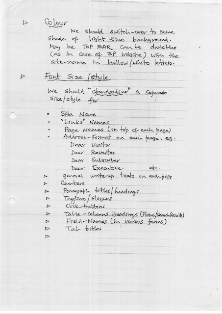
Site Name
-
"Links" Names
-
Page Names (on top of each page)
-
Address format on each page; eg.
-
Dear Visitor
-
Dear Recruiter
-
Dear Subscriber
-
Dear Executive
-
-
General write-up texts on each page
-
Counters▶ Paragraph titles/headings▶ Taglines/slogans▶ Click-buttons▶ Table-columns Headings (Forms/Search Results)▶ Field-Names (in various forms)▶ Tab titles
- Colours of Form-Tables/Search-TablesI suppose these will need to be dark blue (instead of current dark brown) with white letters.
-
Colour of general text/write-upsIf the background of all pages is LIGHT BLUE, then what colour of text characters/alpha will contrast and stand out?Black or White? Will need to be experimented.
▶ Within the text resume, we should highlight (by different colour?) those “words/values” which were picked up by our parsing software & entered into "Contact Details" block.
This will go a long way to impress the candidates (– and recruiters) with the powerful logic of our parsing software.
Because 99% (or more) of the job-ads uploaded will be thru RSS feeds (or spiders to be developed in future) from various job portals. Therefore our counter will read:
But in Admin Tool, “No. of Jobs Posted” will refer to only those jobs actually posted by our corporate subscribers.
Same logic will apply to:
Image 2 (Scan_0007.jpg)
This ratio alone will tell us whether our “Marketing” of website thru parsing & sending out promo email is working or not!
Unless at least 5% of candidates respond positively, we may have to think of other methods to promote our website.
?
I have explained this to Shalaka, as follows:
When a Candidate LOGS-IN on
-
Job-search page
-
Resume-Blast page
Following box will pop-up:


